
3 free font pairings
- Oct 12, 2021
- 2 min read
Fonts are an important element of your consistent brand identity and just like colours or images evoke certain emotions and can enhance your brand voice and message. Choosing brand fonts may seem quick and easy, until you start... That's why I decided to create a series of posts with sample font pairings to help you find those that you resonate with most. Here is the first post in the series:

Ah fonts, fonts! The topic is vast as an ocean... I lost count how many hours I spent browsing fonts libraries. And how many times I said "Oh, how gorgeous, I absolutely need this one". Literally yesterday I bought a bundle of 39 (!) stunning fonts and I am so excited to test some of them in current branding project for one of my clients.
To cut through the tones of fonts available, save you from overwhelm and get you inspired instead, I wanted to show you examples of free Google fonts pairings. The top font on each image is a so-called Display Font, these fonts are decorative great for titles and headings, whereas the font below in the second line is great to be used for body copy where you have bulk amount of text and want it to be legible.
Save this for later if you like these (and let me know in comments).

If you are looking for something modern this combo may be your favourite choice. Philosopher is decorative yet not overly ornamental and Mulish is one of my new favourites, I like how it's rounded and feminine yet very pro at the same time.

Work Sans is yet another great font for body copy. Yeseva One is strong and charming. A balance between Yin and Yang, feminine and masculine. In words of it's designer Jovanny Lemonad
"Yeseva's name is from the phrase "Yes, Eva." As a sign of complete agreement between a man and a woman. I dedicate this font to my beloved wife."
(source: Google Fonts)
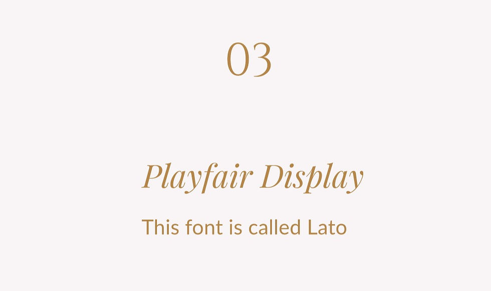
This super classic and classy combination. Playfair Display is very feminine and the sans serif Lato is always a good choice when it comes to great legibility and versatility.
Comments